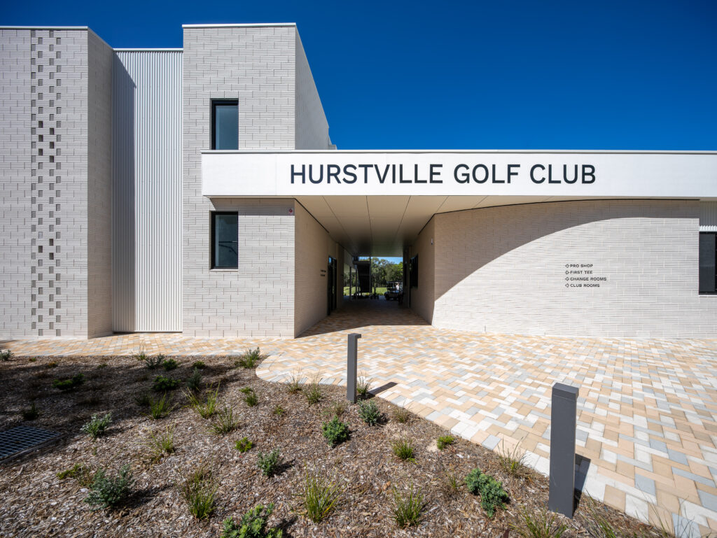
Many local councils are acutely aware of a building’s use-by-date – with their constituents, the public, expecting a certain level of amenity and services. It was hardly a secret that the Hurstville Golf Club, located in the suburb of Mortdale, required replacing after more than 60 years. The 18-hole golf course, with its rudimentary club house, offered just the basics: a Pro shop, a small amount of storage for golf buggies and a modest-sized meeting area for its members.
Beyond redemption, the brief given by the Georges River Council was to still include these functions but at a considerably higher standard, with additional facilities such as change areas and, importantly, a function room. The brief also called for a sizeable viewing platform for its members. Constrained by the layout of the golf course, Webber Architects decided from the outset to locate the new building in approximately the same position, framed by the practice green, the place of the first T-off and the 9th hole. However, rather than designing one larger ‘shed’ to replace the former club, the new design was conceived as interlocked buildings, separated by breezeways. This not only reduces its scale by approximately 400 square metres, but also allows for both light and views to permeate the club from the moment one arrives.
Spread over two levels, with a single-storey pavilion on one side (for storage and golf buggies) and a second pavilion on the other (for the Pro shop), there’s now a considerably more sophisticated offering. And in accordance with the brief, a large function room has been included with a kitchen and also a separate office. While the front façade, constructed in concrete block, bricks and fibro cement, appears relatively closed to the street, the rear elevation, overlooking the golf course, features generous glazing – including a large terrace on the first floor and also an alfresco dining area directly below, with a built-in barbecue. Custom orb used to clad the storage area keeps the design ‘grounded’ – remaining a simple shed for buggies but considerably enlarged.
The Council and the architects – as do the members – also appreciate the importance of creating buildings that require little or no maintenance. Hence, the interior palette is reduced and pared back. The Pro shop, for example, features polished concrete floors, white-painted walls and acoustically treated ceilings. Laminate benches and simple storage/display units frame the space. Likewise, the function/multi-purpose room on the first floor is simply carpeted in a patchwork design to evoke the paving that surrounds the club house. And mindful of its use, predominantly seeing players in action, there’s a seamless division between indoors and out, with large sliding doors on one level and a tilt- up door below that encloses an office/boardroom, ‘blurring’ the lines.
As with many of these council projects, with a number of stakeholders, there’s always a fine balance between meeting the public’s expectations while at the same time creating a public building that will stand the test of time.


